- What is data visualization in business?
- What are the benefits of data visualization principles and practice?
- What is the right type of data visualization for a business?
- Change over time
- Distribution
- Part-to-whole
- Correlation
- Movement
- Ranking
- The best data visualization practices for businesses
- 1. Know the goal of the visuals
- 2. Should address the audience
- 3. Show the KPIs
- 4. Provide a context
- 5. Make the data readable
- 6. Use colors
- 7. Note the hierarchy
- 8. Make the visuals responsive
- What are the different challenges associated with data visualization?
- Lack of data understanding
- Clutter
- Dependence on manual processes
- Lack of data governance
- How can Appinventiv help?
Decision making, across industries, have grown to rely heavily on data. However, the volume of data that a business needs to take proactive and preventive decisions are often too much for a non-number manager to understand. This is where data visualization in business comes into the picture.
Through visualization, managers are better able to understand and explain the direction in which their domains are moving. However, it is one thing to make infographics and explain a campaign performance and it is a completely other thing to convert Boeing’s takeoff and landing data into a visual format.
For managers, this means that they will have to keep a better set of data visualization practices in place to be able to convert the millions of data into an image-based type. A manager who wishes to get great at data visualization process often begins by learning the rules. When should I use a line graph? What is too many when it comes to colors? How can I make the data readable? Do I have to start my x-axis at zero or hundred? While we cannot give an answer to all these questions, we can get you acquainted with the best data visualization practices.
Something that would help you in converting all these massive amounts of data sets into digestible format.

What is data visualization in business?
Data visualization is the representation of information and data in graphs, maps, charts, or other visual format. The process makes it easy for the stakeholders to look at the trends, identify correlations, and identify the outliers in their data and overall business performance.
Considering the ever growing rise in big data, effective data visualization is a crucial step in converting massive data points into a compelling story and actionable insight. All in all, the data visualization process plays a massive role in increasing the revenue, efficiency, and the profitability level.
What are the benefits of data visualization principles and practice?
Data visualization goes beyond the transformation of data in visual formats. It is a key business intelligence capability which is used to highlight the key aspects of a data while highlighting business impacting insights. Insights that help managers make smarter decisions.
Here are some of the benefits of data visualization.
Expedited decision-making: By viewing data sets in a visual format, managers are able to understand the business movement at a quick glance. It leads to saving the time that goes in studying a pile of numbers and sheets.
Greater data exploration: Data visualization tools enable the users to interact with data to discover patterns, see the data relations, and unravel the actionable insights – all without the need of involving a data engineer.
Track business initiatives: The data visualization dashboards help managers track the performance of their initiatives by looking at how the business operations affect the key performance indicators (KPIs).
Increases the ROI on analytics: Since visuals make it easy to understand data, it becomes easier for managers to improve company’s growth by taking decisions on-time.
[Also Read: How telecom companies use big data analytics]
What is the right type of data visualization for a business?
Gone are those days when data was presented in bullet formats or in bar graphs. Today, as the variety and volume of data has increased, so has the types of data visualization. Let us look at the different types of data visualization a manager can choose from depending on what their requirement is.
Change over time
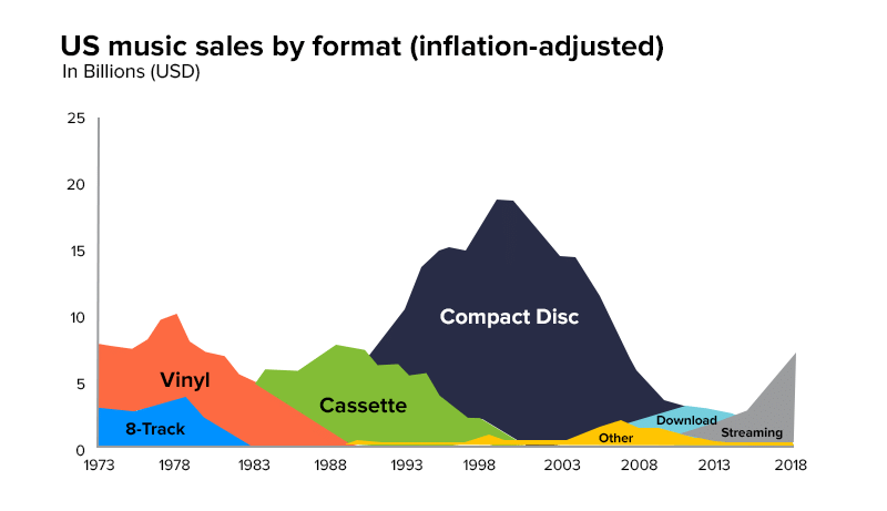
The purpose of these charts is to show the data has been changing over a period of time. It could be data around the product sale over 5 years or simply the user demand over time.
Chart types:
- Area Timeline
- Circles Timeline
- Calendar Heatmap
- Column-Line Timeline
- Column Timeline
- Gantt Chart
- Fan Timeline
- Scatterplot-Line Timeline
- Line Chart
- Slope Chart
- Seismogram, etc.
Distribution
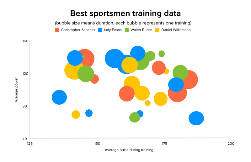
The purpose of this data visualization type is to show how the data has been spread across a certain group. This helps managers with spotting the commonalities and outliers. An example of this could be public officials wanting to see the income characteristics of a population.
Chart types
- Boxplot
- Barcode
- Dot plot
- Cumulative curve
- Histogram
- Violin, etc.
Part-to-whole
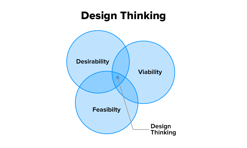
This chart highlights how a single item can be broken down into its component parts. For example, a manager wanting to see the sources a lead came in from.
Chart types
- Bar stacked proportional
- Pie chart
- Venn diagram
- Treemap
- Stacked column
- Waterfall chart, etc.
Correlation
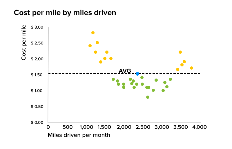
This visualization type conveys the relation between two elements. For example, a retail house wants to know how the stock in inventory and the items on shelf correlates from one store location to another.
Chart types
- Scatterplot
- Bubble chart
- Line columns
- XY heatmap, etc.
Movement
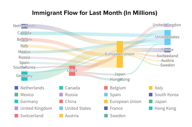
This chart showcases the movement of data between conditions. For example, how migration happens between one location to another.
Chart types
- Network
- Sankey
- Waterfall
- Chord, etc.
Ranking
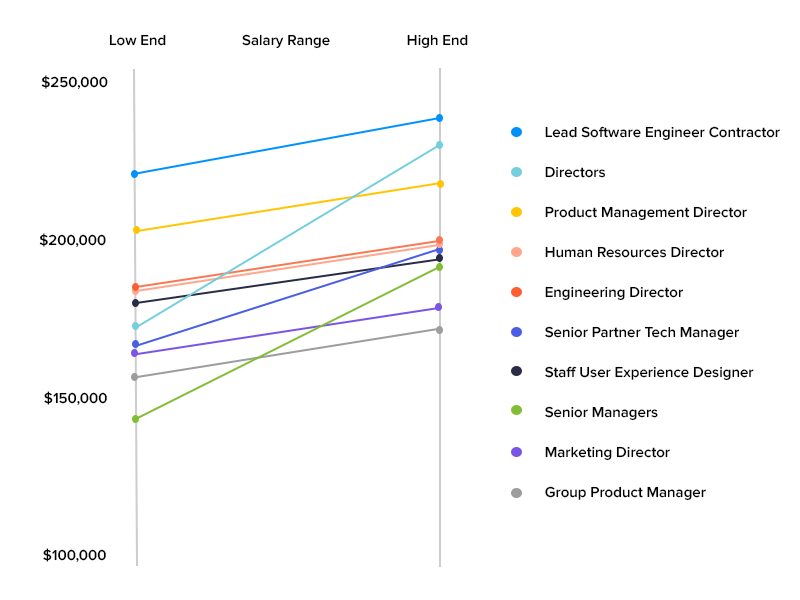
This visualization chart shows how a list of data relates to each other. For example, descending order of locations demanding x products.
Chart types
- Bump chart
- Bar ordered
- Dot plot strip
- Slope chart
- Symbol proportional ordered, etc.
Now that we have looked into the basic elements of data visualization for small and mid-size businesses, it is time to get down to the best practices. After all, only when a manager knows how to visualize data perfectly will they be able to measure the importance of data visualization in business.
The best data visualization practices for businesses
As we highlighted before, having the correct data is only half the work. It is equally, if not more, important to display it in a way that the stakeholders are able to understand, giving them a place to convert their data into actionable visuals. Here are some of the key practices that businesses along with their data analytics service partner must follow while creating data visualization dashboards.
1. Know the goal of the visuals
Before you start putting up the data in a visualization tool, it is important to understand the goal of the process. You will have to alter what you show in the data according to the audience and what you want them to do next. For example, if your stakeholders want to see your campaign performance, you won’t show them data around the tools you invested in or the task list of the agency that you hired for the campaign.
2. Should address the audience
When you design your data visuals, it is extremely important to answer these questions:
- Who is going to consume the data?
- What challenges do they face?
- What metrics or goals matter to the audience?
- What decision do I want my audience to take?
The answer to these questions would then help you collate data points that are of interest to your specific audience.
3. Show the KPIs
The ultimate goal behind the exercise to convert data points into visuals is to draw actionable insights. And the only way to achieve that would be to measure the data against the Key Performance Indicators (KPIs).
Suppose your target was to increase the lead count for your ABC service. Now to show it visually, you would have to look into the different KPIs – the traffic source, lead quality, etc.
4. Provide a context
Data visualization as a practice is most helpful when it shows the relation between datasets and its overall impact. While storytelling is not a must-have data visualization best practice, it helps with –
- Inspiring action
- Influencing the decision
5. Make the data readable
Ensuring the clarity and consistency in the design goes a long way when it comes to the readability factor. The presentation of data should be a healthy mix of visuals and text, with the text supporting the visuals wherever necessary and the visuals being well placed.
Another aspect to consider here is minimization of clutter. Since the whole and sole aim of data visualization is to communicate data easily, it is crucial that the images don’t have unnecessary information or are not a victim of information overload.
6. Use colors
Just because you are working with data, it doesn’t mean that the visuals should be in black and white. Using different color combinations can help with representing different aspects or trajectories of your business journeys. A point that you can consider when looking at which color or color combination to choose can be to look back at your brand design guideline and work with your brand colors.
7. Note the hierarchy
Hierarchy is one of the key concepts of data visualization. It is the one thing that users understand intuitively, thus, it comes on the data visualizers to use them in the most optimal manner.
As you have guessed, hierarchy means putting the most important information on the top and then going below from there in a ‘most to least important’ fashion.
8. Make the visuals responsive
Responsive design refers to an approach where the pages display well irrespective of which device they are viewed on. The design here automatically adapts to different screen sizes, making it easier for the end user to read and digest the content.
So here were the best practices that best portray the importance of data visualization for a business. Now while we have looked into the dos, the conversation will be incomplete without the challenges.
Let us look at the challenges that businesses face when they get down to handling the data visualization process themselves.
What are the different challenges associated with data visualization?
Businesses often tend to invest in visualization tools to convert their data into media format. However, there are a number of challenges associated with this approach.
Lack of data understanding
Irrespective of how nice the visuals look, businesses usually don’t have much idea of the story behind them and what insights to draw from them. In order to best link data with business objectives, it is important that the manager/ owner of the visualization process understands what they want the data to reflect.
Clutter
Managers, as a way to give out a “complete” picture of the business growth sometimes fall victim to information overload. They add too much information in one slide, instead of thinking of the structure and necessity. Ideally, the information should be kept to a minimum and heavily focused on the individual audience’s interest.
Dependence on manual processes
When managers create visualizations by manually entering the datasets, it can lead to several errors. Errors around incomplete, incorrect data, mathematical errors, etc. A solution to this can be adoption of AI-based tools that would automate the process.
Lack of data governance
The moment people become comfortable with using spreadsheets and analytics tools they start creating their own presentations, throwing all the structures and decided layout out the window. What is necessary is that managers should have a proper data governance practice in place to ensure that all the data structures are consistent.
We understand that being on top of all these benefits and challenges while creating a data visualization process in place can be difficult. A lot of our clients face the same issues. This is how our data analytics service helps them.
How can Appinventiv help?
Appinventiv recently helped a leading telecom company in the US create an efficient data analytics platform. In the process, we also deployed BI solutions that provided actionable data visualization through interactive dashboards for different customer management areas. The results? 100% processing of customer consumption data and 85% increase in data quality.
Schedule a call with our experts now to discuss the data analytics and data visualization solutions specific to your business’ use cases.


10 Use Cases and Benefits of Adopting Predictive Analytics in the Oil and Gas Industry
The oil and gas industry has always been at the forefront of technological advancements, constantly seeking innovative solutions to improve efficiency and maximize output. It is where predictive analytics emerges as a game-changing solution, transforming how companies manage operations, optimize production, and mitigate risks. In the oil and gas sector, where even the smallest oversight…

Unlocking the Power of Operational Analytics - Use Cases, Best Practices, and Key Implementation Strategies
Data is the new asset in today's digital age, prompting businesses across industries to explore innovative ways to leverage its transformative power and gain a competitive edge. This is where business operational analytics steps in. It has emerged as a game-changer for companies aiming to optimize performance, streamline operations, and make data-driven decisions. By tapping…
