Sometimes you hear people utter the phrase “I had an intuition” at which point you may wonder whether he/she has the ability to view the future. But that isn’t the case. Intuition is the feeling people derive based on instinct and this instinct isn’t based on conscious reasoning.
This subliminal, cerebral concept holds immense significance in the world of mobile app design. After all, why do we associate one symbol with a specific action? Is it a natural tendency or one that emerges from our daily experiences? Today we’ll chase the answers to such questions and determine what features and facets constitute an optimum intuitive search functionality in a mobile app.
What is Intuitive Design?
An intuitive app design consists of everything that defines the importance of UI/UX design in an app. Its components, be it the typography or content flow, allow guesswork to guide action, say searching for information. An intuitive design subtly conveys its meaning at the same time staring the user in the face, quite literally. It is so symbolically evident that the user cannot and must not think of anything else, other than the intended use of the feature. An intuitive design architecture must engender the following characteristics to be considered instinctive:
Discoverability is second nature to mobile app design search. From the menu bars to the profile sections, you can explore everything within a click-or-two without losing your way.
Affordance is another word for perception. Intuitive UI uses a barrage of visual cues to tell the user what would clicking a button result in. Its elements keep in mind what the user wants/expects from a button. This brings us to our next point.
Expectations of the user should be complemented by visual cues. A bell commonly denotes a notification, thumbs-up a like, etc. Intuitive UI design integrates a diaspora of icons that appeal to common sense.
Efficiency should be thought of in terms of minimalism. A minimalist design is non-confrontational in that the users go through exactly the steps that they must to accomplish a task.
Responsiveness of the app communicates whether the performed action by the user is successful. Intuitiveness takes it a step forward and expounds on corrective measures in instances of a boo-boo.
Importance of Intuitive UX Design
Mobile has gained a domineering position in almost every aspect of our life. For many, they’ve totally replaced desktops. As a matter of fact, 40% of people use their phones for online searches. Of all the video views in the world, more than 50% come from smartphones.
Factoring in the time and utility people thrust on to their phones, intuitive design elements pose as an exercise that any mobile app design agency would undertake foremost and one that everyone should know when reading into a mobile app design guide.
Creating Intuitive Mobile App Search
Search is probably the first action most users perform in any app. It’s a wormhole that lets users fast-forward to their area of choice. Yet, you would find striking differences between the search functionality of a great app and a good app.
Having been a mobile app design company since our foundation, it is our DNA to go intuitive-first, as we have on so many occasions. As a result of which we’re in a position to share with you our thoughts on how to go about designing a user friendly in-app search option. We’ve divided the process into 4 stages for better understanding.
1. Search Bar
Let’s begin with the physical attributes of the search bar, its form, and on-screen positioning.
Search Bar Size
The bible for UX search best practices recommends making the search bar big enough.
If your design permits, the search field should ideally be an expansive box placed in the view of the user. Often, you would come across search icons, clicking which expands the search field. Though it appears interesting, yet from a UX point of view, it bears negative results and thus can be noted as a UI/UX mistake you should avoid.
Not recommended
Contextually, the icon is supposed to simplify typing a query, but the icon-only search adds an extra step before the user can do so. Opting for an open text field would point the users in the right direction.
Recommended
Search icon
The search field should, without fail, be represented by a magnifying glass. Thanks to all the snitch flicks that stereotyped magnifying glasses to look for something, people have come to accept the sign by default. Use the most simplistic image of a magnifying glass with little to no graphical additions. This is one place where the less you do, the more it speaks for itself.
2. Entering Search Query
Most of us have been typing in the Google search bar for years now. Yet, we commit typos. Misspellings annoy users as not everyone is a grammar-nazi and usually want to rush through the entire step. Therefore, it is the responsibility of a mobile app design company to make entering the search-input as easy as possible.
Keyword-based Search
Nothing overboard about it. You enter the search query in the search field and down below appears a list of search results that match your keywords. Click the option closest to your intended information and there you go. Quite a few apps continue to employ this mechanism. Twitter for one displays both the hashtags associated with your query followed by the social handles if any.

But such a system has its shortcomings. It depends on the consumer typing the correct input every single time. This is solved by some of the more innovative solutions thanks to the emerging deployment of AI in search, as we shall see in the coming sections.
Filtered Search
Websites with a product catalogue stretching into the thousands integrate heavy handed filtered search to deliver a refined search functionality in the app. Examples include domains such as E-commerce, Edtech, and travel. Given that there are thousands of results matching the inputted keyword, it is wise to let a user zero-in on options most closely related to their search.
While some apps offer the option to add filters right before hitting the magnifying glass, there are others that daunt the user with total results and then make them sort through.

Predictive Search
In terms of apps that involve a lot of data entry, such as conversational apps (like Whatsapp) or lifestyle apps (like Pinterest), incorporating an auto-complete option is a good idea. The feature is one of the ways AI can help develop next-gen apps. The app design firm that undertakes the development of your application must build in-app capabilities that register recent searches as part of the search history. Upon re-entering a keyword the first thing that the user would see in the auto-suggest drop-down list will be his/her recently entered keywords.
If yours is not an E-commerce store, then auto-suggest should blend in perfectly as there is a pattern to everything the user does and your job is to uncover that to make in-app search simple.

Limited Search
Onloading your app with various sophistications may not always be the right choice. Websites want to prolong user-sessions in order to maximise page visits. An app runs contrary to this theme and focuses on recurring visits by the user, even if the sessions last a couple of seconds.
Design search considerations could entertain the idea of limiting search features in an app. Keep only the amount that transports users where they want to be, for instance, compartmentalizing your content into categories as is done in Hotels.com.

Voice Search
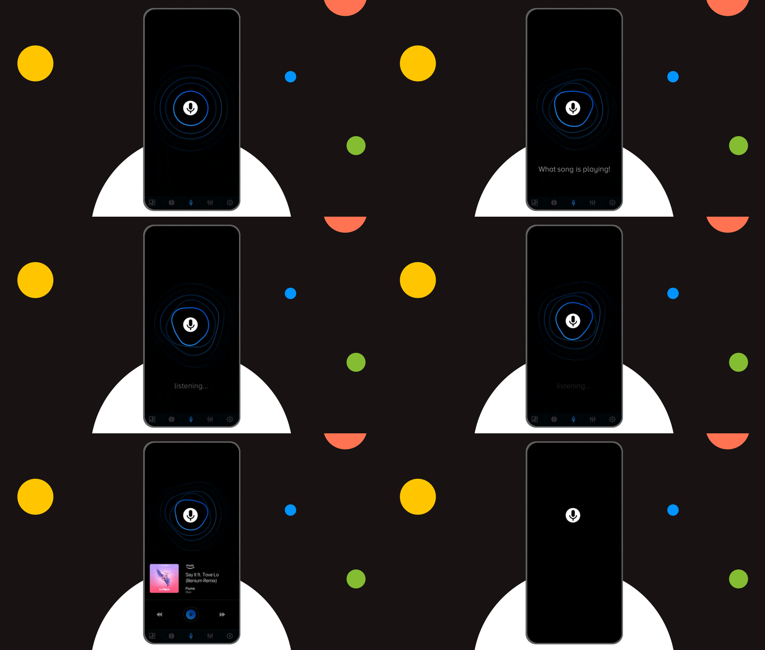
Voice search is designed for a hands-off experience while using the app. Apps that cater such a functionality often tend to be those that are used for cross-connection and multimedia broadcasting. Google offers one of the best voice search functions beginning which the market started designing content that is voice search friendly. Spotify is yet another example, which allows you to search songs with the hold of a button.

3. Fetch Results
The thumb rule states search results should come up as soon as the finger hits enter. However, you could seldom face network lag, in which case the user should know to expect a delay.
This speed test indicator is a good example. It uses a speedometer animation to divert attention from the fact that the app is consuming time to calculate the actual network speed. If alongside the animation, you can display the total time (hopefully seconds) the user should wait then all the better.
4. Display Outcome
Mostly, the search results are expected to be accurate. But as a mobile application design company, Appinventiv also pays close attention to error-prone queries that lead to a dead-end. What comes next shouldn’t be anybody’s guess but a rational step-by-step approach to get the right input from the user, as we find out in the upcoming sections.
Tackling “No Matches Found”
Never leave the customer staring at the wall. Even if the code does not find suitable results to display, offer something to the viewer. When there are no relevant results to show for, show alternative or remotely related products or the most popular search categories. You never know if that was the intent of the user. A blank page in such conditions leaves a bad taste in the mouth of the user who may take the app to be inefficient.

Correspond the Right Message
While displaying related products is one way to appease the user, what if the problem runs deeper than that. The backend could actually have malfunctioned and there is no shame in admitting and underlining the encountered problem to the user. But make sure you give hope that the issue may be resolved sooner than later.
Amazon does one of the best gimmicks in this area, with finesse. Everybody loves dogs, so Amazon developers thought why not use them to their advantage. Have a look at that error message.

Help Users Correct Entries
We all make typos. It’s normal. And most people sensibly accept their fault when an algorithm points it out. In case of Google searches, the majority of us are glad that the engine knows our search intent as it rectifies and suggests correctly spelled words. This doesn’t change with the app, but it can get better.
Without fail, whether you’re building an app inhouse or outsourcing the work to a mobile app design and development company, make sure the algos are trained to correct misspellings.

Create Category Headers
When the content is highly diversified it is best positioned under parent categories. Take the case of Spotify. It has millions of songs and they have demarcated specific search categories by which to sort them. Their parent tags are artists, songs, podcasts and if the user knows their genre, then they can jump right into it. Think of how you can distribute your content likewise.

Choose a Layout Template
Presentation has a lot to do with the way your floor the content. Netflix is a prime example, pun intended, to display a side-slide search functionality. It proved oxygenated air against the stale, tried and overused style of content flow that included carousels, and pagination. Infinite scrolls have also been proven to be addictive and equally effective.

On-demand Loading
Also known as lazy loading, it is a content optimization technique deployed to display the content that is intended for first, than bulk loading the page in one instance. It saves time and consumes lesser network bandwidth, and renders instant gratification to the user. Lazy loading allows developers to avoid code execution that can be delayed till the point the user demands further information.
Drawing it to a Close
Appinventiv started out of an intuitive decision by a group of friends and today has a growing stature in the world of mobile app development. Despite the accolades, we keep our head to the ground, happily accept projects that we can wrap under our sheets and politely admit if something is beyond our means, which has thankfully never transpired. If intuitive design is what got you here, we bet you’d be amazed to know the full extent of our services. Find out now.


11 Principles of UX Design From A Startup Perspective
When we hear the word design, we think of creativity or some creative role, in which an individual crafts and designs something beautiful. But, there is a thing with UX design that makes us understand that only aesthetically good designs won’t make for a usable interface. A good user designer makes great user research. When…

15 Steps to Mobile App Redesign for Market Domination
App redesign is no joke. If you run a mobile-powered business then you are virtually on life-support while indulging in a UI UX overhaul. And if you do not realize that already, then there is all the more need for someone to point you in the right direction. We assume you want a word by…


